
Demonstrating UX Judgment Through System-Level Decisions
A conceptual UX case study focused on decision-making, trade-offs, and user risk reduction. This demonstrates how to reason about user behavior, cognitive load, and risk when there is no obvious "best practice" solution.
The Problem
The product is a mature SaaS platform with active users managing multiple projects. Users were accidentally deleting important projects.
Watch: The existing delete flow — users confirm deletion, but often on the wrong project
Key Finding
The issue was not comprehension, but something deeper in how users interact with the system.
Reframing the Problem
Instead of asking the obvious question, the problem was reframed to shift responsibility to the system.
Old Question
"How do we make users more careful?"
New Question
"How might we reduce destructive errors without increasing friction, breaking flow, or blaming the user?"
Core Issue
The core issue was misidentification, not intent. Users mentally associated "Delete" with "remove from view" — while the system interpreted it as "destroy permanently."
Constraints
The solution had to respect the following constraints:
- No additional confirmation steps
- No extra warning modals or checkboxes
- The delete action must remain visible and accessible
- No language that shifts blame to the user
Solution Strategy
Instead of reinforcing the moment of confirmation, the solution restructured what deletion means in the system.

The redesigned flow: Delete → Archive → Restore or Permanent Delete

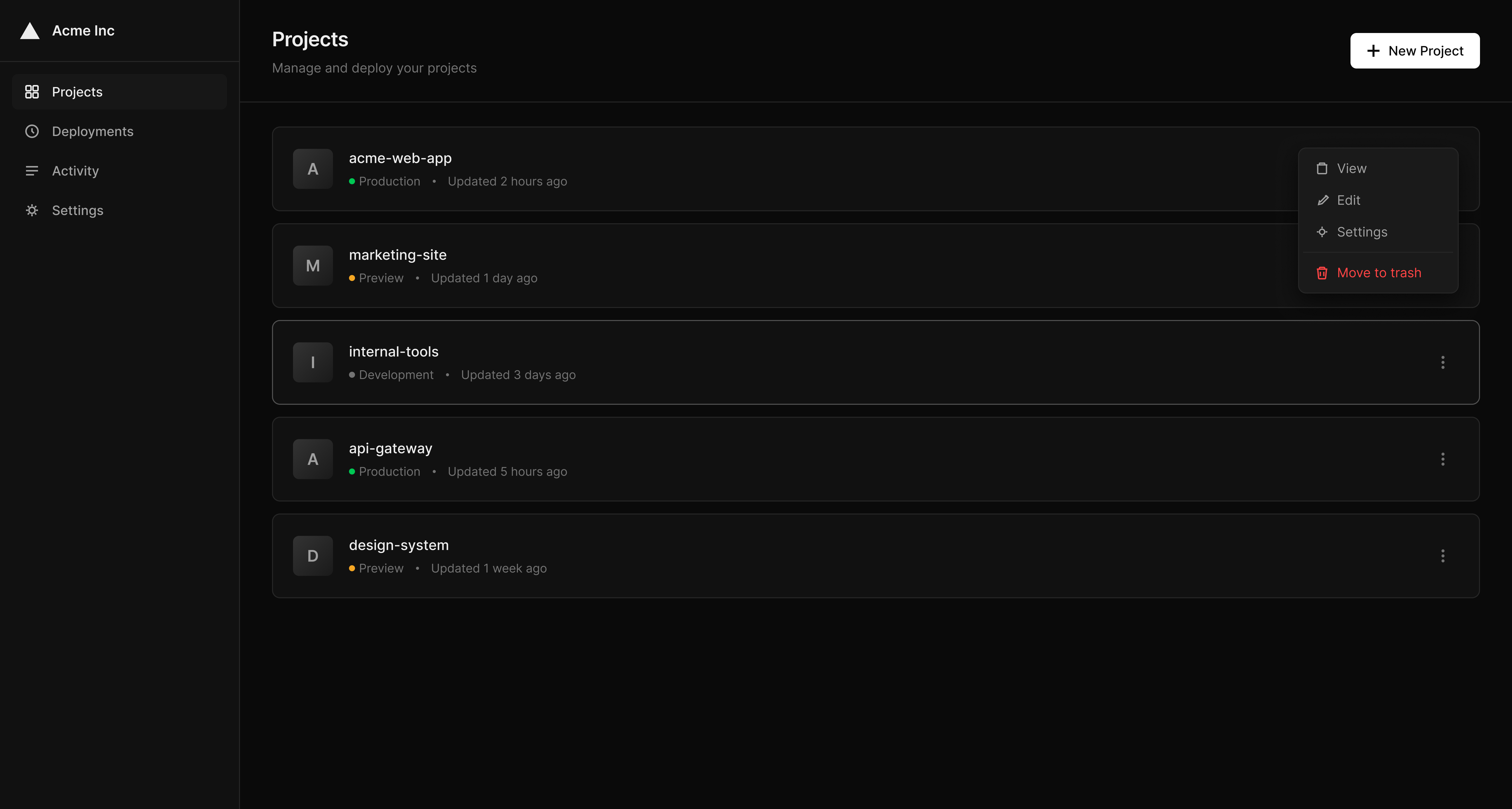
Project dropdown with 'Move to trash' option
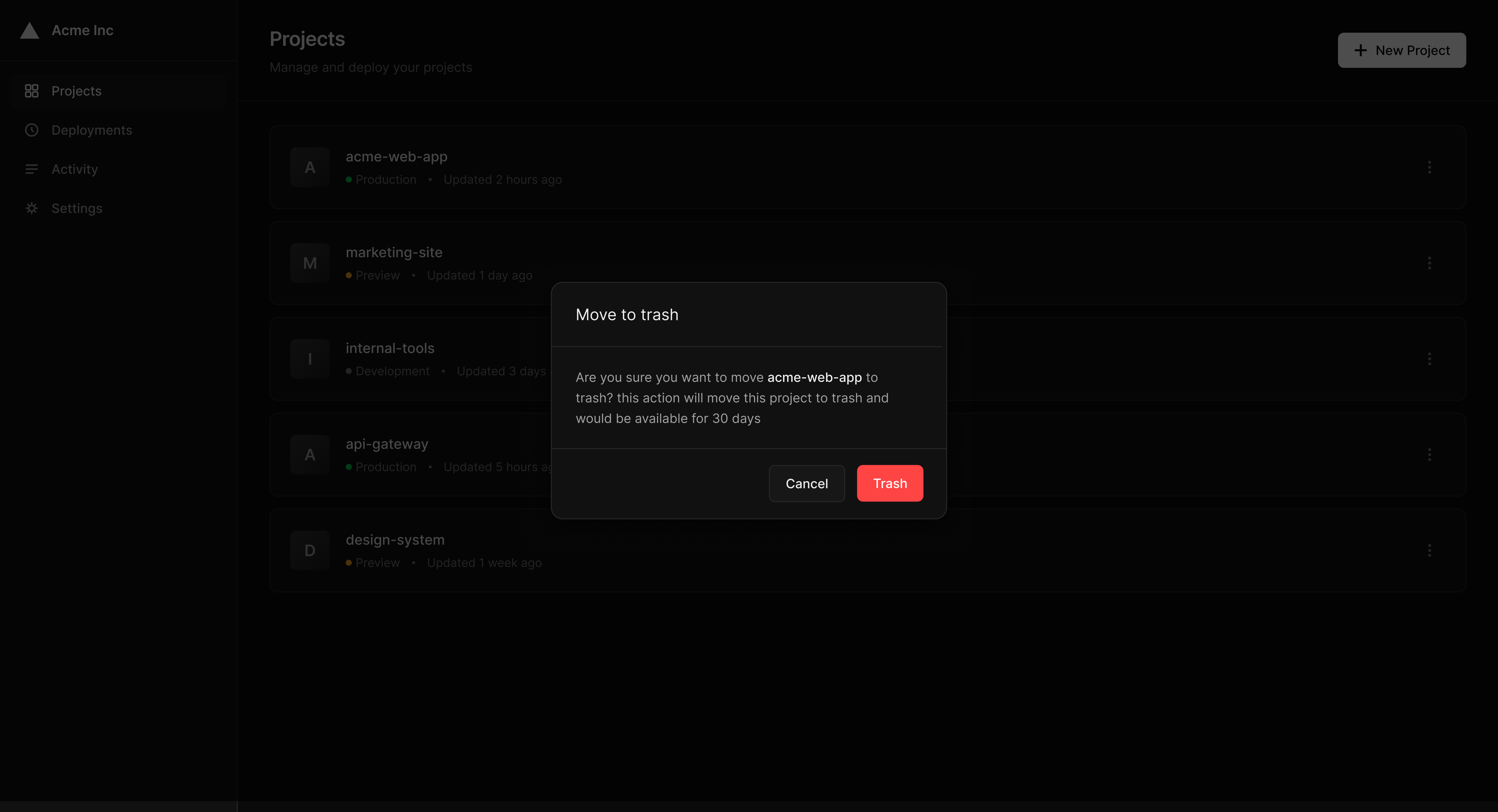
Move to trash confirmation modal
Permanent delete confirmation modal

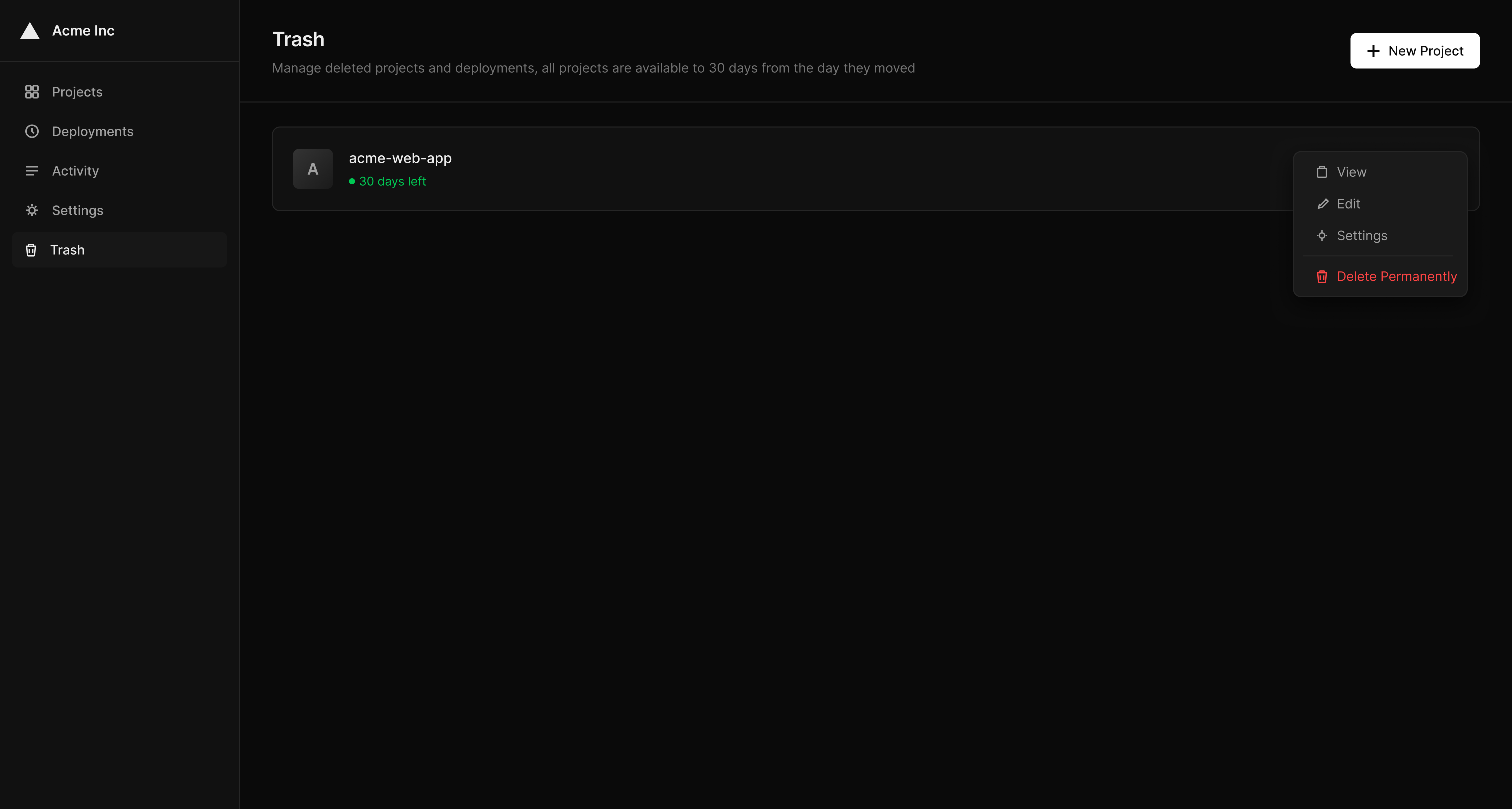
Trash page with restore option
Project action menu with delete permanently
Design Principles Applied
01
Protect users after action, not before it
02
Align system behavior with user mental models
03
Reduce risk without adding cognitive load
Trade-offs & Decisions
Trade-offs Accepted
- Additional system complexity (Archive state)
- More product logic behind a simple action
- Grace period management and cleanup
What Was Avoided
- Adding more confirmation steps
- Increasing warning severity
- Shifting responsibility to the user
- Treating symptoms instead of causes
"Good UX does not prevent action — it prevents irreversible regret."
Reflection
This case demonstrates how UX decisions often require resisting obvious solutions, designing for error recovery instead of error avoidance, and treating the system as a partner in user success, not a gatekeeper.
The strongest UX solutions are frequently invisible — users only notice them when something doesn't go wrong.